
Not Just Another Productivity App.
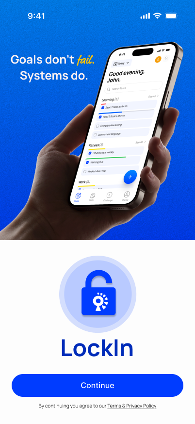
Rather than build another rigid productivity tool, we set out to create a 'compassionate assistant' that closes the gaps we saw in everyday goal and productivity apps.
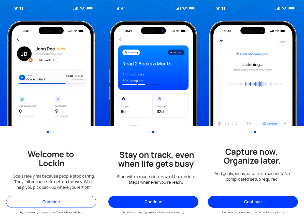
Research
Most productivity tools expect perfect consistency, heavy setup, and constant manual input. When life interrupts, they punish users with streak resets, cluttered backlogs, and guilt‑driven reminders. This leads to mental fatigue, loss of trust, and eventually abandoning the system altogether.
As a result, we aimed to solve the core issue of "productivity burnout" by eliminating administrative friction, automating tool integration, and replacing guilt-inducing streak mechanics with compassionate recovery systems. Our aim was to built specifically for users who value focus and real-world growth over gamified gimmicks.
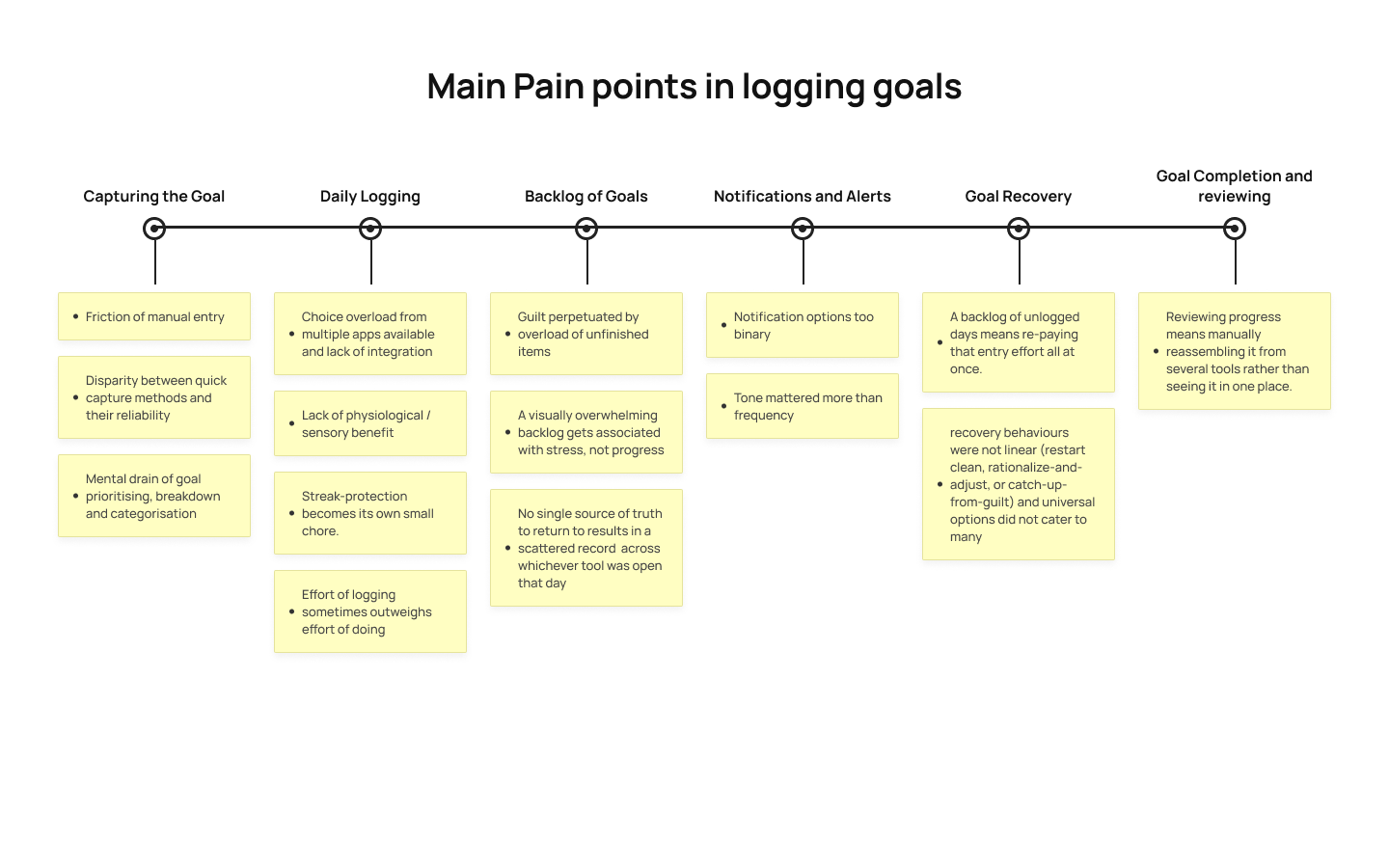
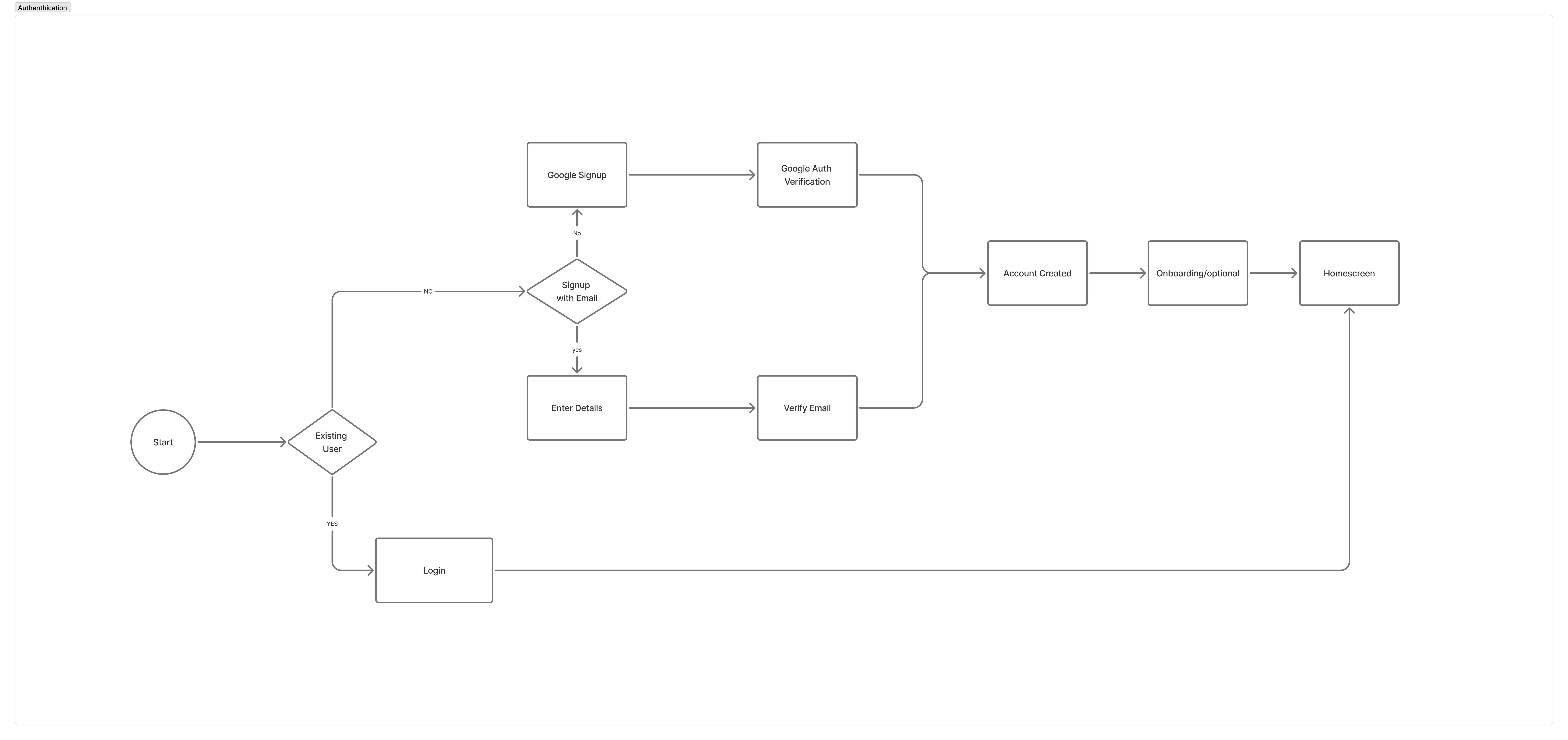
Market and user research sought to understand not just what features were needed, but how users felt when traditional tools failed them. From there, we mapped user journeys to identify moments where automation could replace manual input, and where recovery mechanics could replace shame-inducing streak resets.
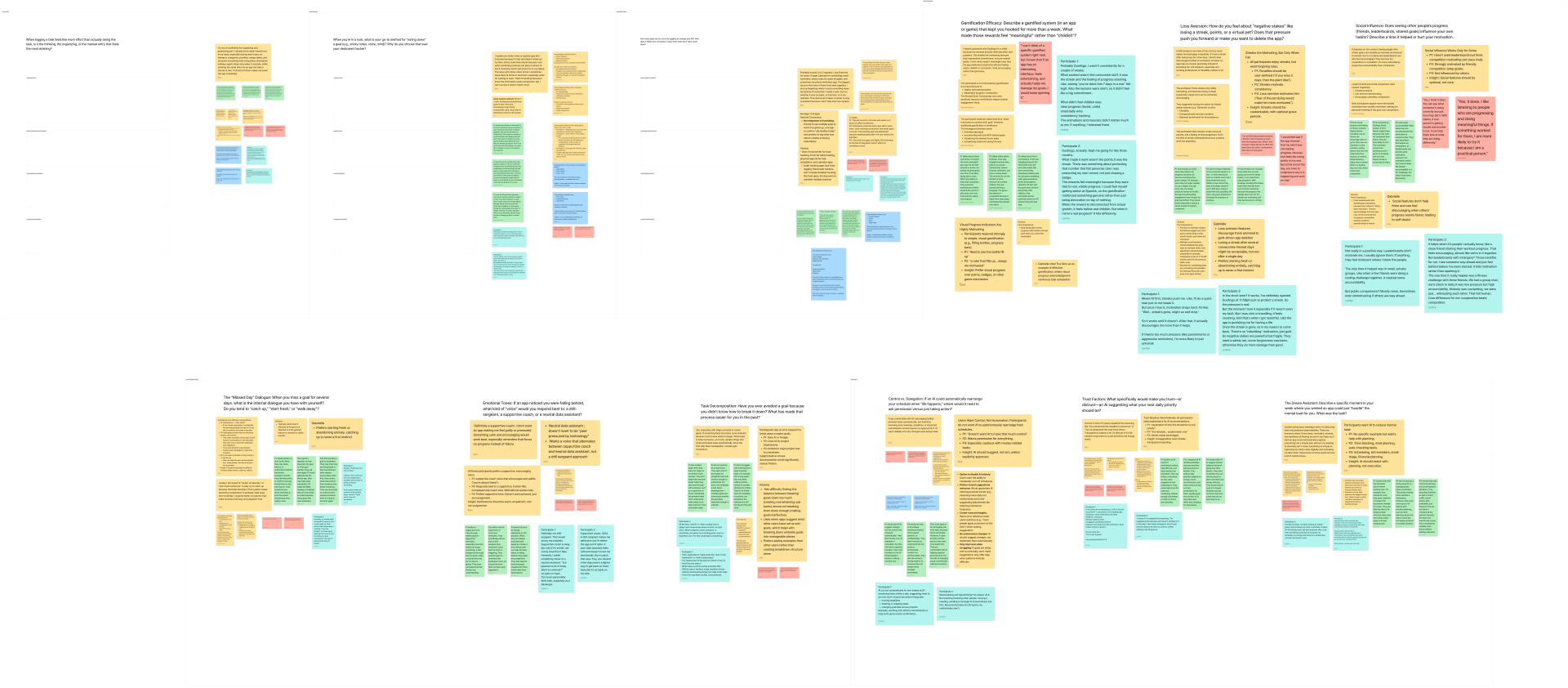
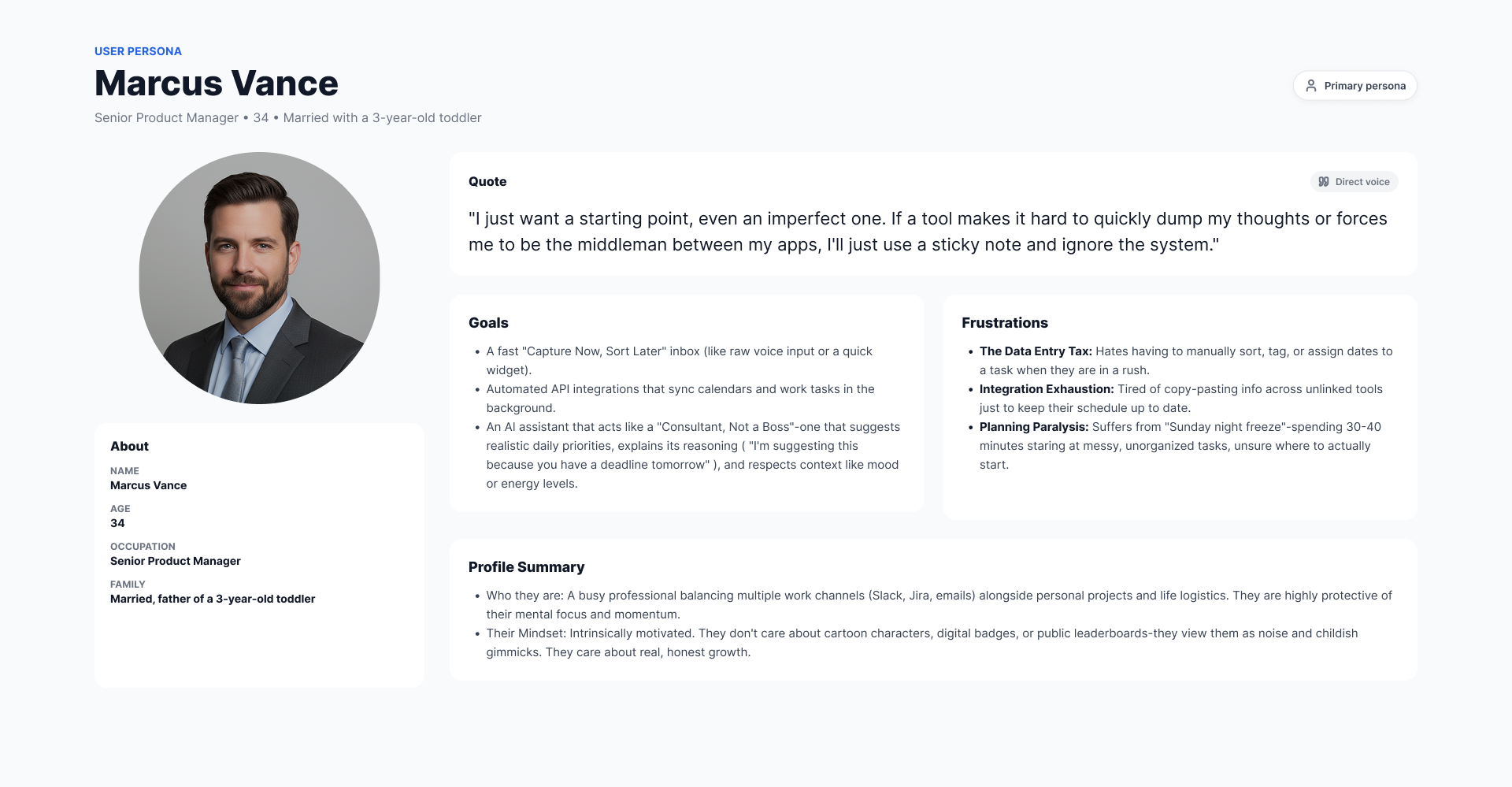
Prior to the user interface production, we conducted user research using surveys, interviews, empathy mapping and affinity mapping.

Design Decisions
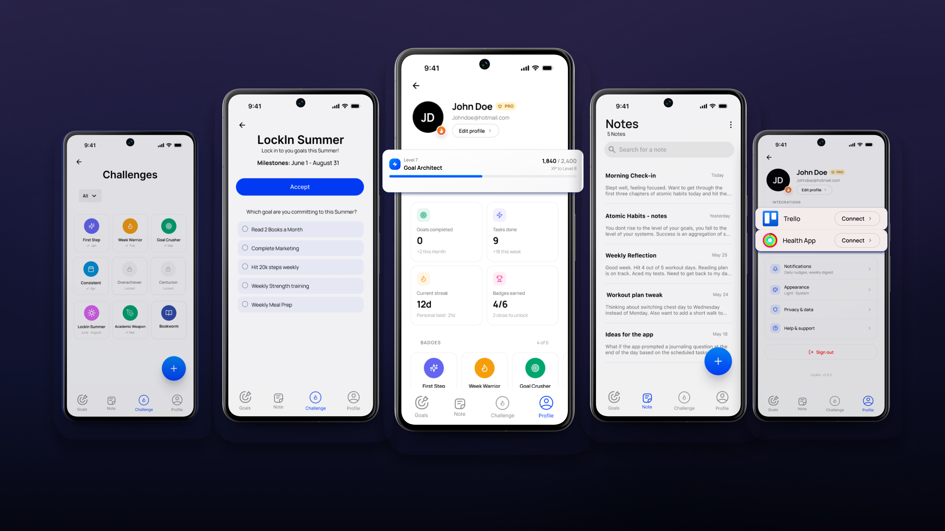
Application features easy task entry complimented by AI conversational integration to facilitate fluid and efficient task entry. Dashboards utilize a judgement-free recovery system to emphasize real progress rather than expecting perfection. Thus supporting users in their continued goals rather than further discouraging them.
Design highlights
Our design hence tried to address the pain points and ensure that solutions were integral to our design.
Pain Point 1: Interaction Cost
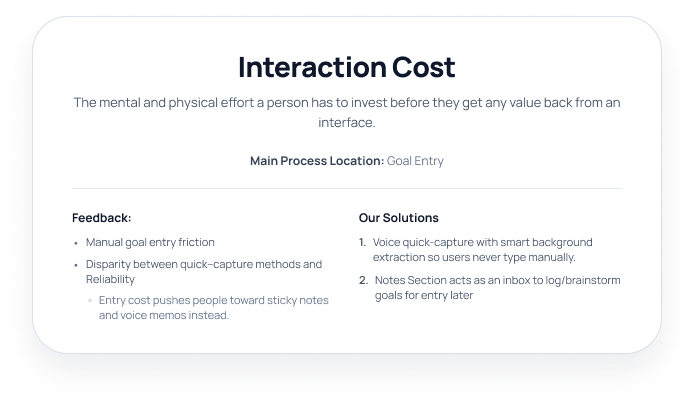
Voice Capture
We were able to Use AI to assist with Voice input coal capture.
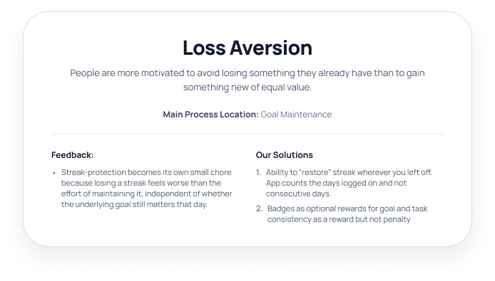
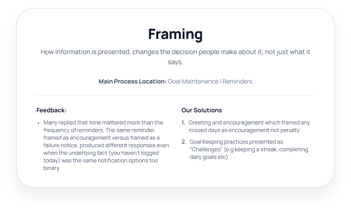
Pain Point 2 & 3 : Loss Aversion and Framing
Judgment-free recovery system
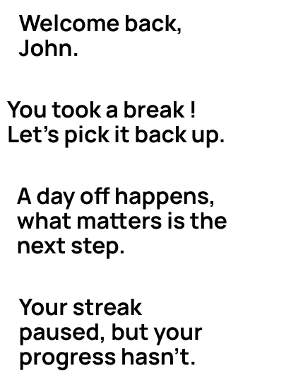
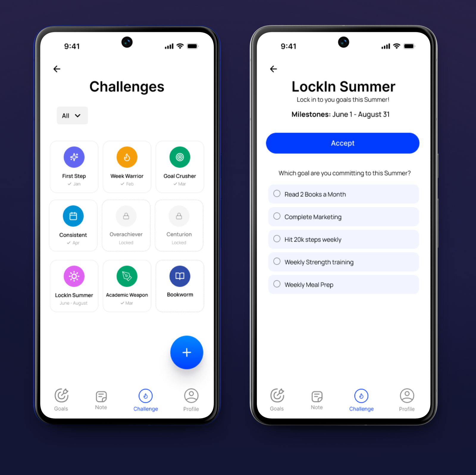
When users miss goals, the app offers compassionate recalibration options instead of streak resets or punishments. Users are also given rewards based oon task completion
Pain Point 2 & 3 : Loss Aversion and Framing
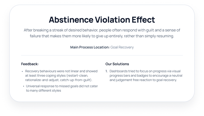
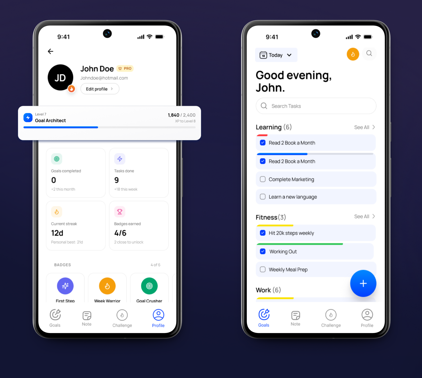
Progress clarity over guilt metrics
Dashboards emphasize real progress and momentum rather than perfection or consistency streaks. task are presented as a percentage of a goal visually by a task bar to constantly view progress
Pain Point 4 : Cognitive Overload
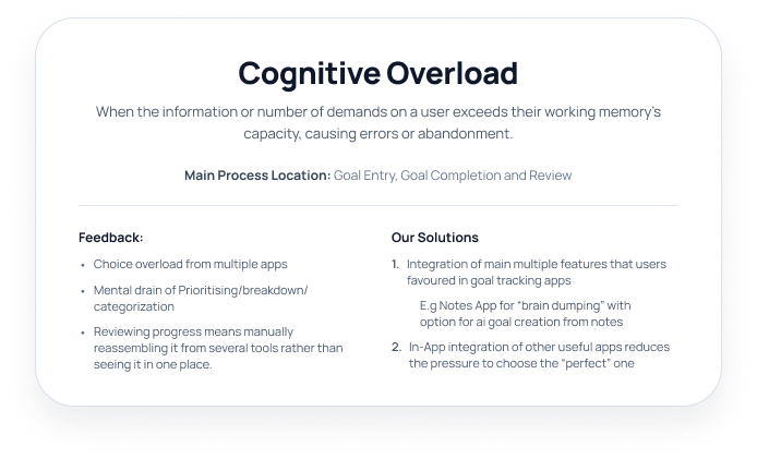
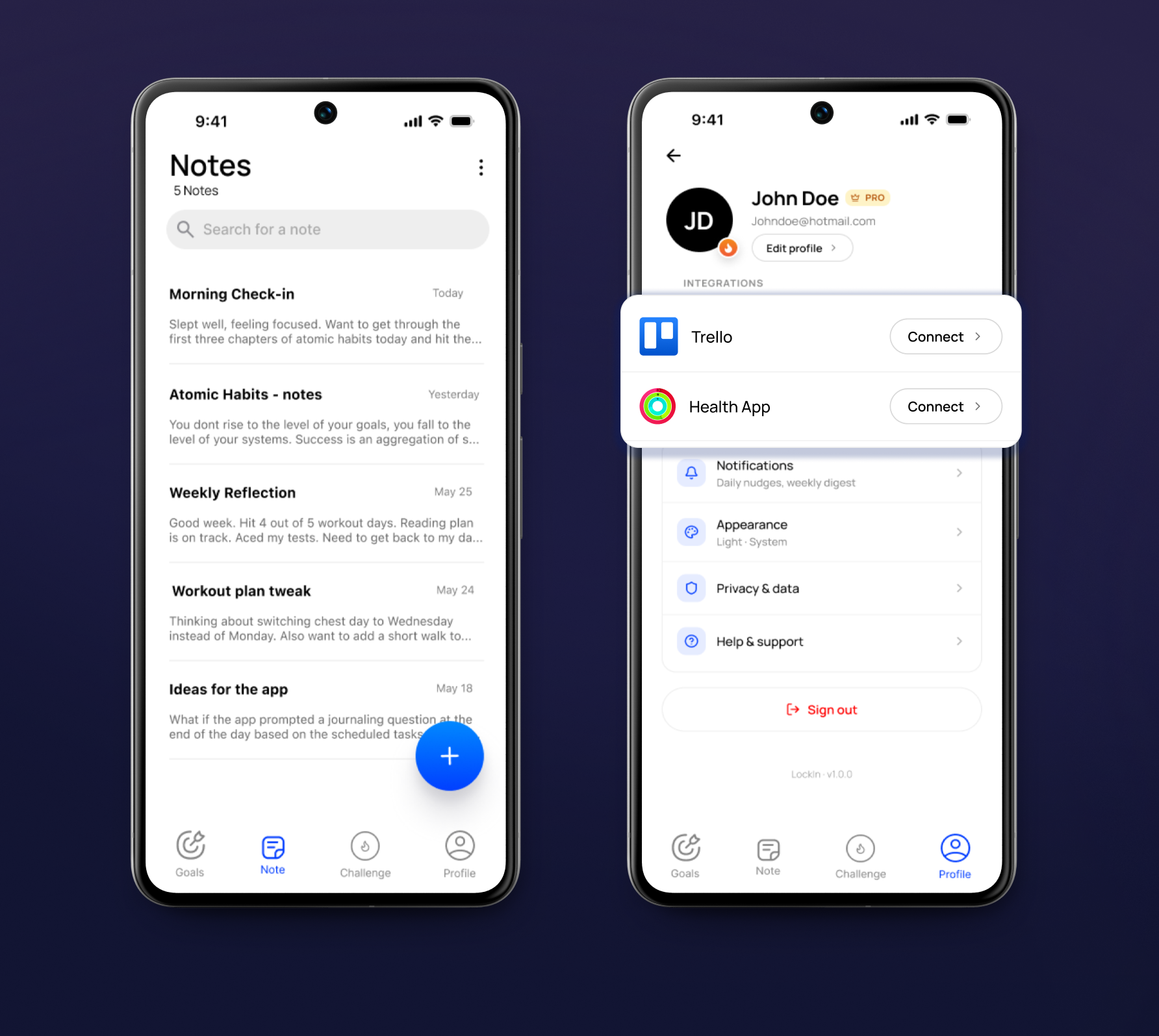
Multiple Optional Design
Features reduced the paradox of choice provided by multiple differing apps and integration allowed for the inclusion of any features that we had not considered or that previous data was already on.
Visual language
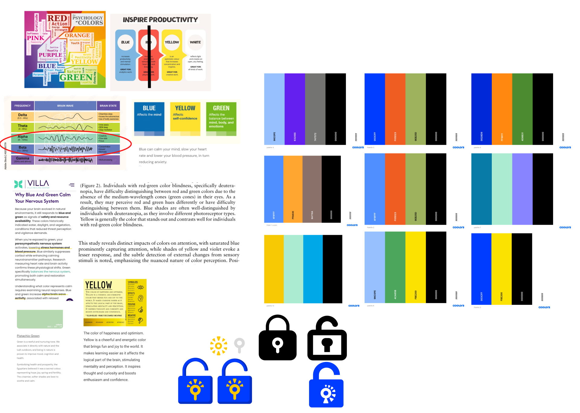
Research findings: Studies on brainwave activity show that alpha and beta wave states associated with focus, flow, and concentration are more readily activated by cooler tones. Blue has been shown to lower heart rate and blood pressure, reducing anxiety and supporting analytical work, while green activates the parasympathetic nervous system, lowering stress hormones and increasing alpha wave activity linked to creativity and flow. Yellow, by contrast, stimulates the brain's logical processing and boosts confidence and engagement, making it effective as an accent for calls-to-action rather than a dominant tone.
- Color Palette: Based on this research, I selected a blue-and-green primary palette to establish a calm, focused environment, paired with a yellow accent to energize key interactions (CTAs, rewards, progress states) without disrupting the app's overall sense of calm.
- Typography: Clean, human-scale typefaces that feel approachable and trustworthy
- Icons: Approachable, action-oriented design that guides users intuitively
Interactions
- Smooth state transitions between goals, progress, and recovery modes
- Gentle transitions and affirmative feedback; replaces urgent notifications and warnings with supportive cues
Accessibility and performance
- Full keyboard navigation for power users
- High color contrast ratios across all UI elements (WCAG AA compliant)
- Screen reader optimization with descriptive labels and semantic hierarchy
- During usability testing, a more saturated or multi-color interface introduced visual noise that distracted from the app's focus-driven purpose, so we made the decision to simplify — leaning more heavily on blue and green while pulling back on competing visual elements. This kept the interface calm and legible, reinforcing the cognitive research behind the color strategy. That said, we see this minimal direction as an early iteration rather than a final answer; there's room to further test how far color, contrast, and accent usage can be pushed in future rounds without compromising the calming effect the app is designed around.
Reflections
Design Is Communication
Working on LockIn taught me how much a team's success depends on clear, consistent communication throughout the entire process. Learning to communicate design rationale clearly, check in more proactively, and make sure everyone was working from the same understanding of the problem became just as important as the design work itself. It reshaped how I think about collaboration as it is integral to how the product actually gets built well.
Scaling Research to Match the Problem
This project also taught me how to scale user research to match the size of the problem. We ran user surveys, conducted interviews, and used affinity mapping to work through everything we gathered. The process was intense. We really dug past surface-level feedback to identify the actual pain points users were experiencing, and then translated those pain points into design decisions. I now cannot see research as a single step to check off, but as a rigorous process where each method builds on the last to get to insights that are specific enough to design against.
