

Helping patients navigate the lab with clarity, before they even walk in.
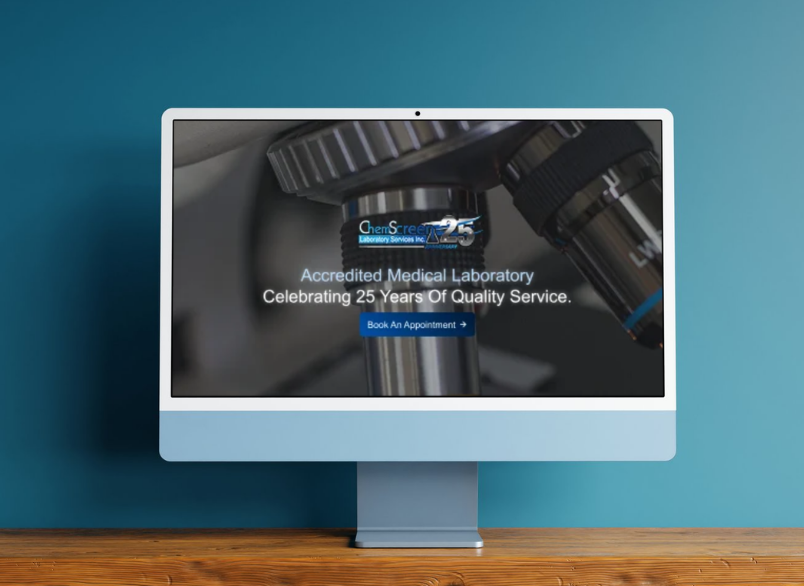
A leading medical laboratory seeking a major digital upgrade, needed a website that matched the quality and credibility of their services. The redesign focused on creating a modern, patient‑friendly experience that increased engagement while making essential information clear, accessible, and easy to navigate, guiding patients confidently toward using their services.
Research
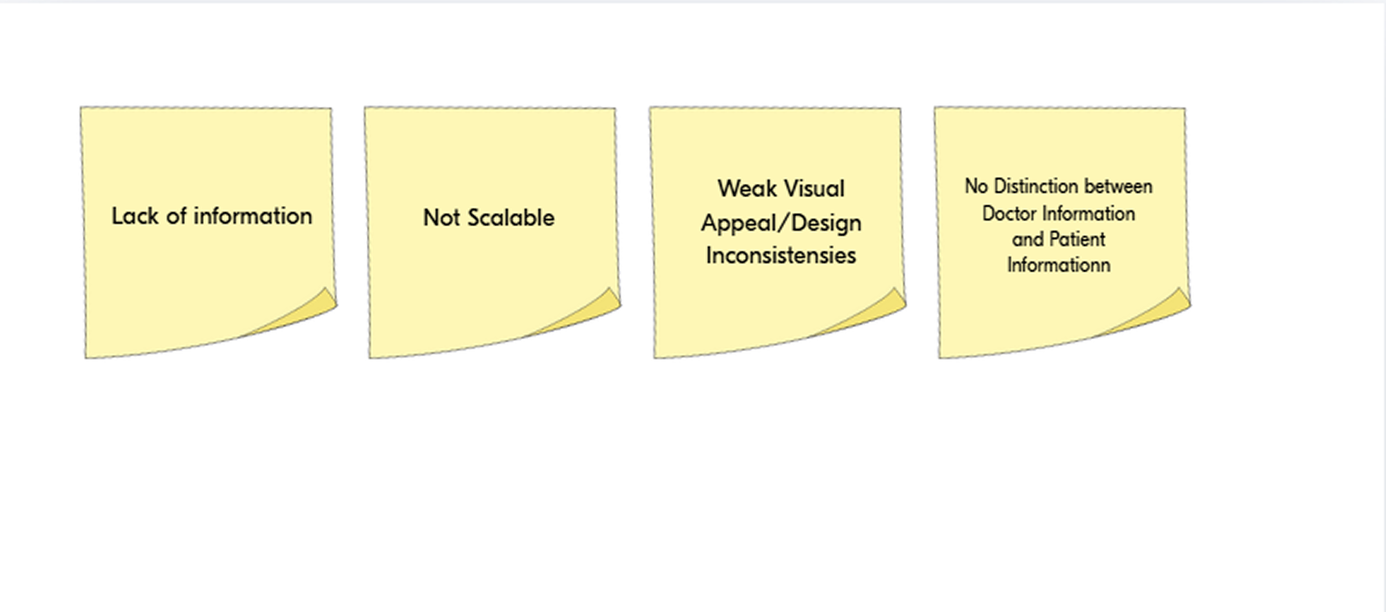
Stakeholders had already identified pain points with the current website, including a lack of information, limited scalability, and weak visual appeal. My research surfaced two additional issues: a need to differentiate for its two core audiences (patients and doctors) and design inconsistensies throughout.
To better understand the information architecture (IA), I mapped out the existing site's page hierarchy. This made it easier to see where the site's actual structure didn't match how users would expect to move through it, and gave me a clear reference point for reorganizing the IA in my redesign.
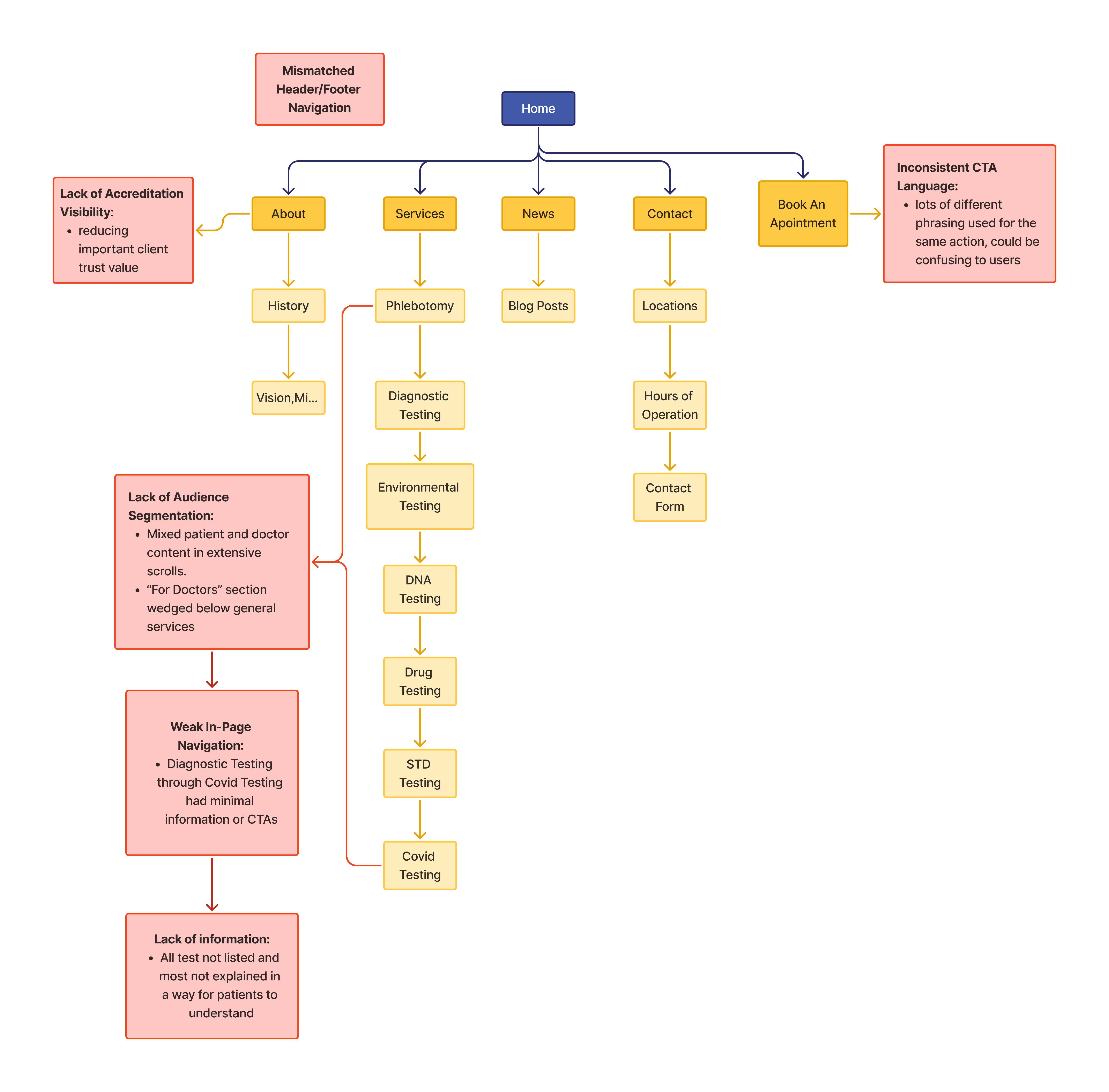
The "Before" map shows a single-chain "Services" structure (7 Services) with no patient/doctor content separation, alongside six flagged UX issues: inconsistent navigation and CTA language, poor accreditation visibility, weak in-page navigation, and incomplete patient-facing information. The core problem is that the site was built additively without clear hierarchy or audience segmentation.
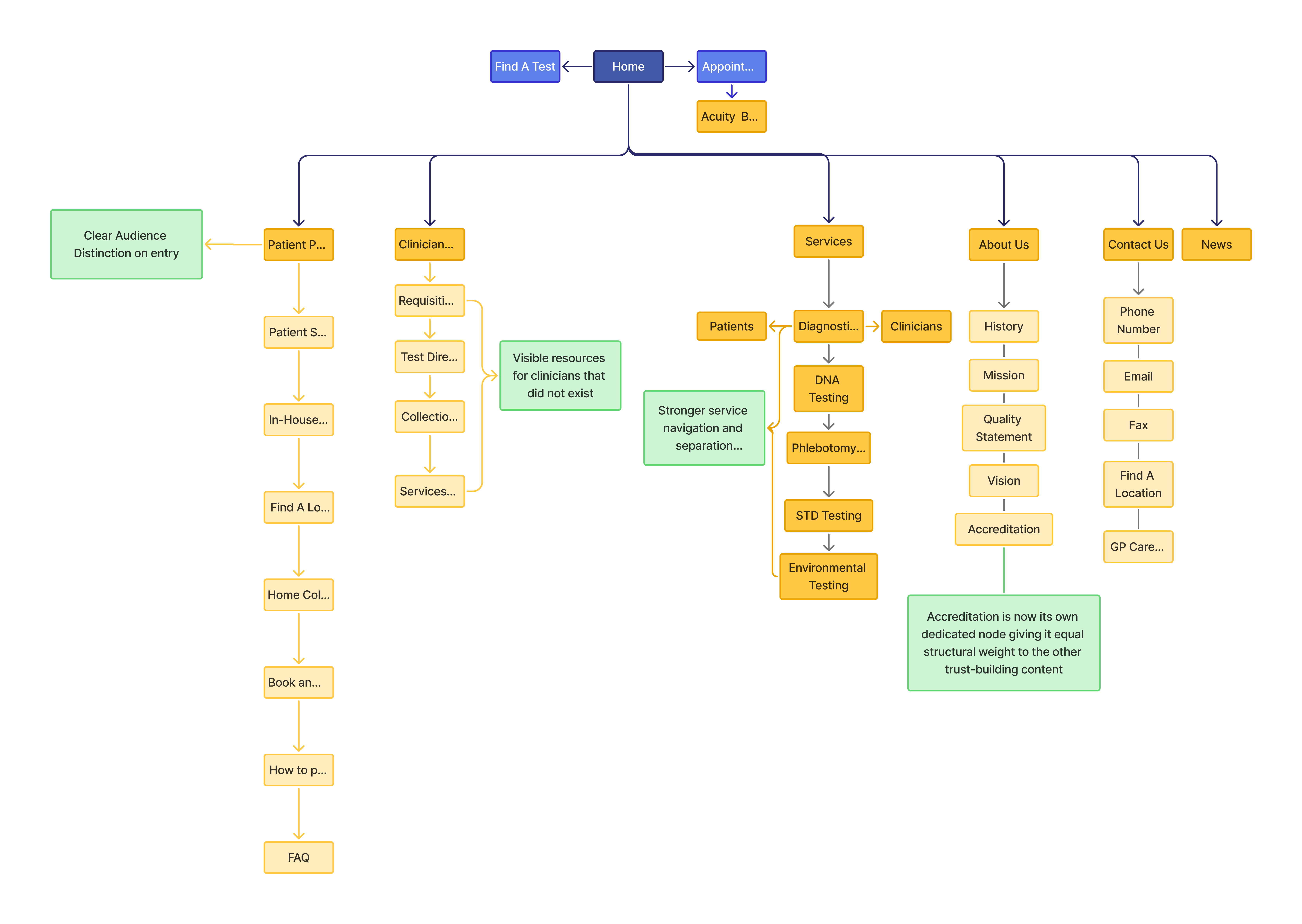
This restructured site map separates patient and clinician content into dedicated pages, surfaces a resource hub for clinicians that didn't previously exist, breaks the old single-page testing content into distinct navigable pages, and gives accreditation its own dedicated node for stronger visibility and trust.
Design Decisions
We worked towards an appealing redesigned structure, navigation, and visual system that gives patients a clearer, more intuitive way to understand lab services and move toward booking an appointment, replacing a fragmented experience with a single, easy path to follow.
Vertical Layout with Consistent Design
The original home page had excessive whitespace and inconsistent density: sections like "For Patients"/"For Doctors" and the Haematology/Chemistry blocks on the Diagnostic Testing page had uneven vertical gaps between text and images, so the page felt unfinished and forced a lot of scrolling to reach very little actual content.
I aimed to change the layout to a vertical arrangement with a clear hero section and then important information distributed throughout.
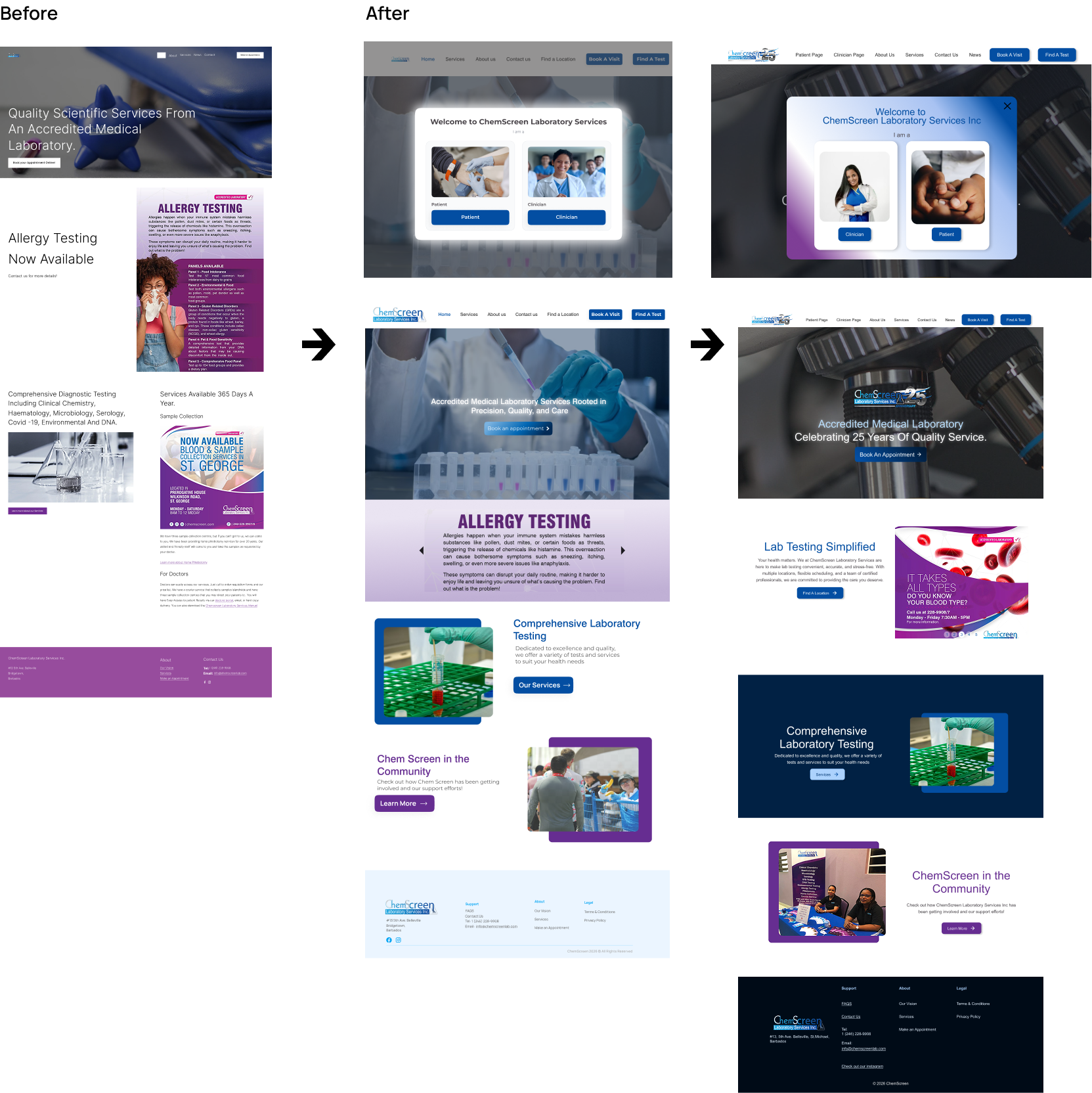
There were two revisions due to considered accessibility and stakeholder request. The final design has a more defined layout with coloured sections breaking up the info and the test banner slider replaced by a half page slider with lab specials and promotions.
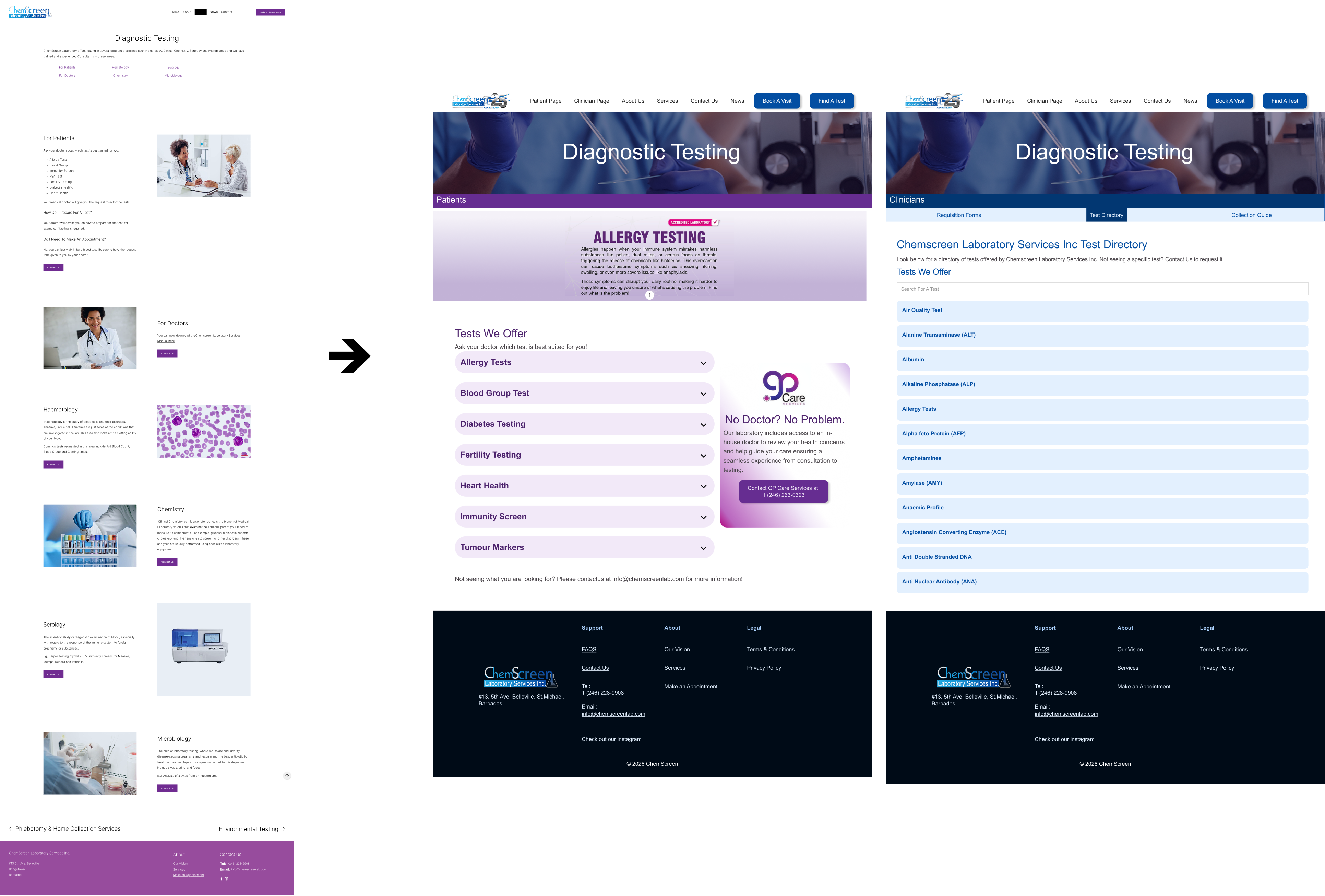
Diagnostic Test and CMS Test Directory
On the older Diagnostics page, top headings undersold what was being offered, with an ambiguous target audience for Haematology, Chemistry, Serology.
The newer page separated the audience so that for Patients, tests offered were grouped in more recognizable health issues and for clinicians a full CMS test directory was made. Each service page was also organized by accordion menus, giving persons instant access to test more information on each test.
The biggest highlight of the Clinician page was building the Test Directory as its own CMS. I structured the data model myself and populated it with the details clinicians actually need for each test, including:
- Whether the test is walk-in or requires booking
- Sample/collection type and container
- Units and reference values
- Turnaround time
- Sample stability criteria
This also helped scalability problem flagged in the original research.
Distinct Audiences
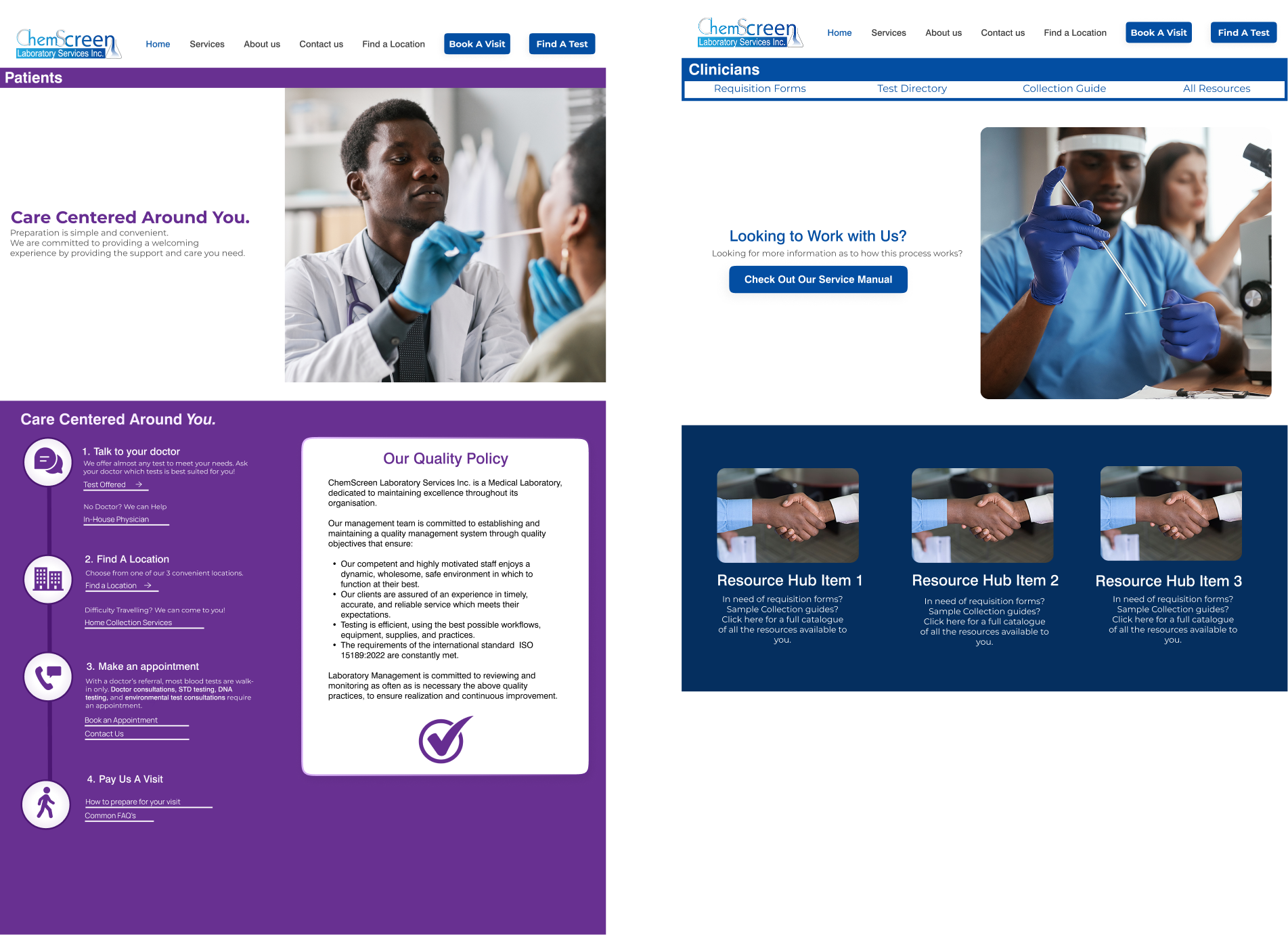
Two distinct pages now divides the site and gives a clear division of information by both audience and purpose: patient’s get a guided, step-by-step path that answers "what do I do first?," while clinicians get a structured resource hub that answers "where do I find what I need?"
Rather than one shared space trying to serve both, each audience now has content shaped around what they actually came to do.
Patient Page:
Turning it into this vertically flow with links gives patients an actual procedural path that matters more for a lab/diagnostics site due to the commonly reported anxiety of first-time patient's around "what do I do first," not "what tests exist."
Clinician Page:
The dedicated resource hub (requisition forms, test directory, collection guide, services manual) gives clinicians a destination that now addresses a real content gap as clinicians had no visible, structured place to find what they needed.
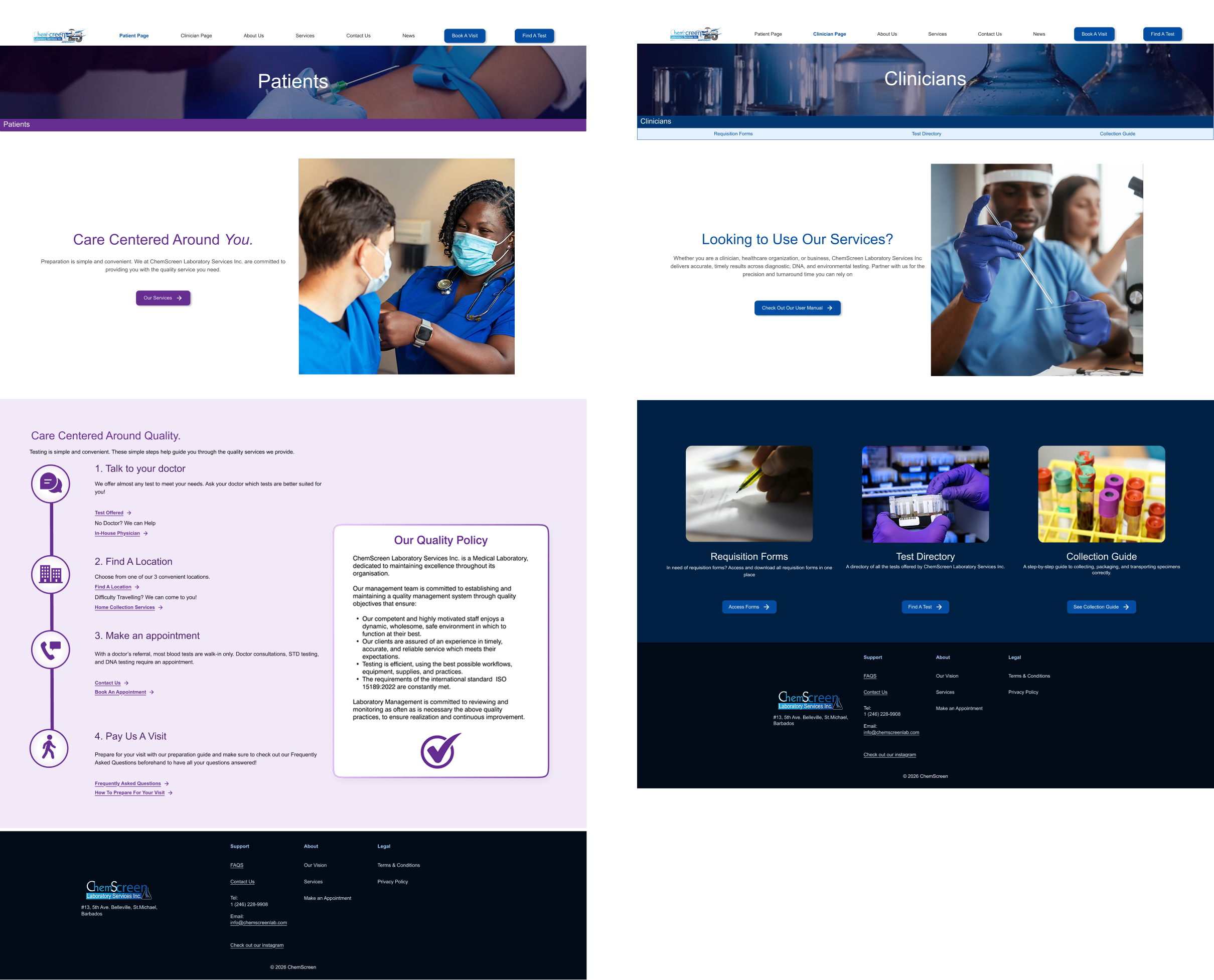
Upon review the imagery was changed from a covid test procedure to something more timeless and welcoming. Similarly the resources deemed most important to clinicians was agreed upon and a Resource Hub, the Test Directory and a Collection Guide were linked to the Clinician resources.
Visual System
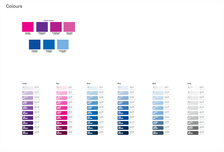
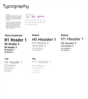
One consistent typographic and color system replaced the mismatched one. Now headings, colours, and buttons share one type system, and navy blue is the dominant brand color with purple pulled back to an accent role.
Reflections
The site is live, with development continuing to refine the interface, validate user flows, and work toward a measurable lift in engagement and clarity.
Balance Stakeholder Request and Design Intelligence:
One of the biggest lessons from this project was learning to balance stakeholder input with design intelligence. Stakeholders bring valuable context as they know their business, their clients, and their day-to-day pain points in ways research alone can't always surface. However, their requests aren't always the most user-centered solution. Part of my growth as a designer was learning to translate what they were asking for, into what the underlying problem actually needed, rather than either dismissing their input or following it uncritically. I used research to validate, challenge and sometimes reframe stakeholder requests. I kept my process completely transparent for when the final direction shifted from their original ask.
Some example included:
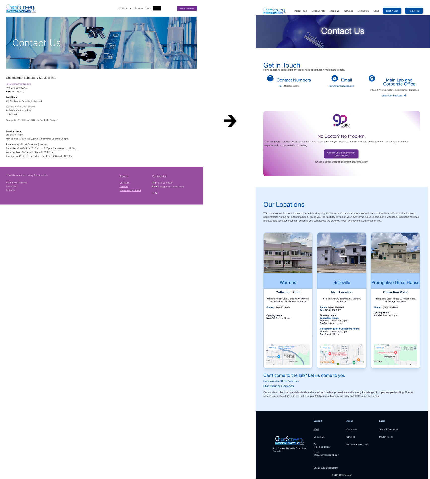
Map Links included for Location
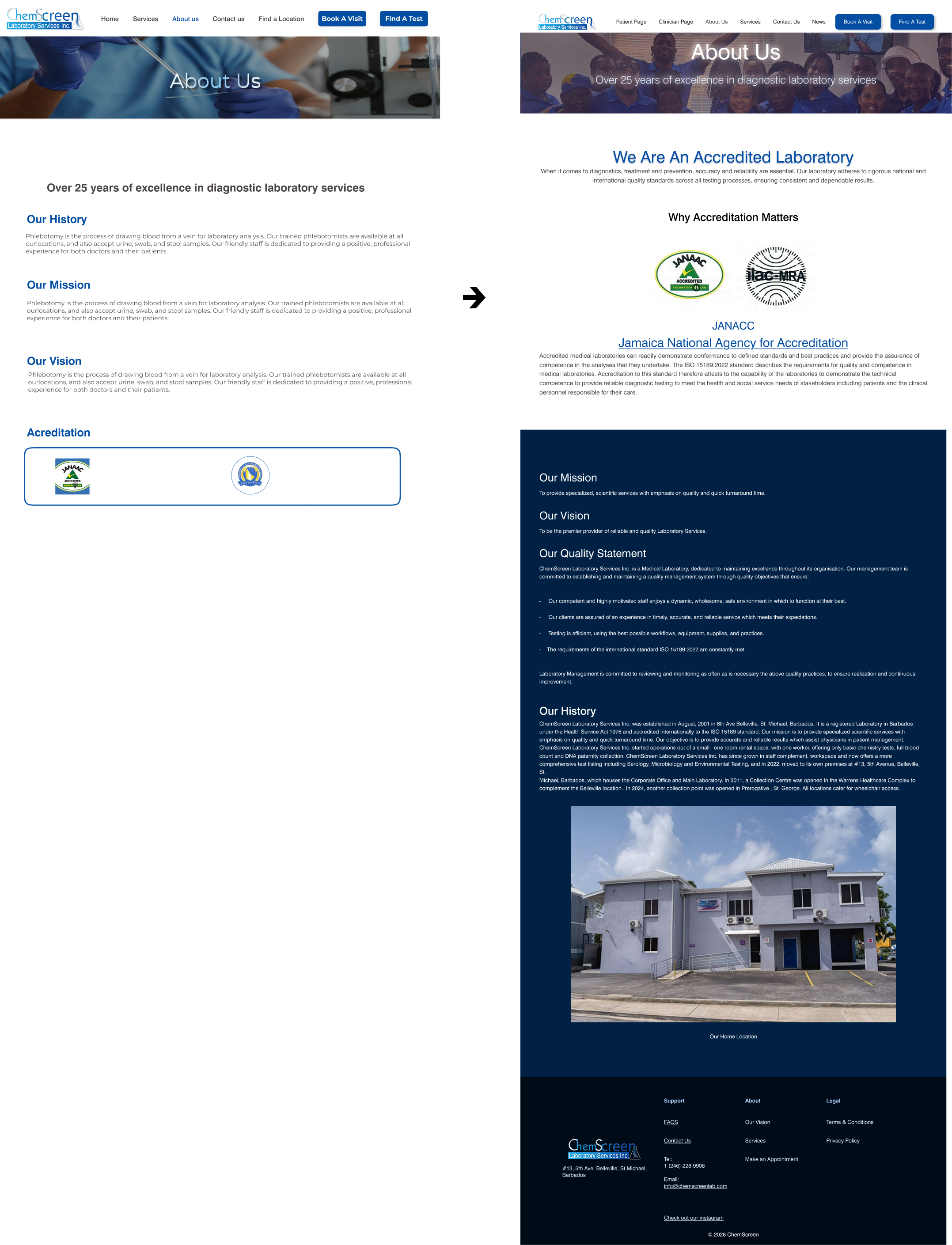
The Movement of Accreditation to be more Focal
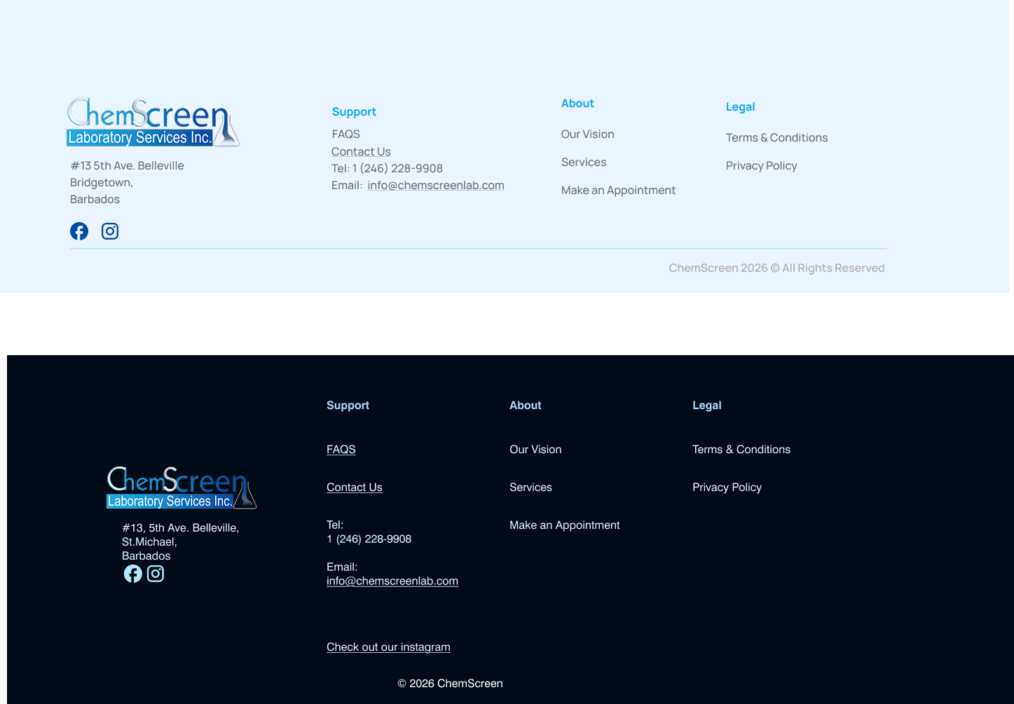
Addition of Clinician and Patient Pages to Nav Bar and Footer Design Change to Improve Accessibility and Usability.


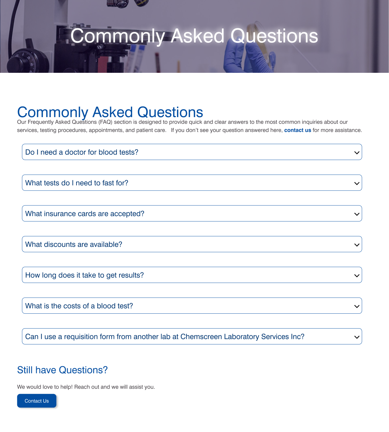
Addition of a FAQ Page
Webflow Development
Another major reflection was how much this project pushed my technical fluency in Webflow. I came in with some working knowledge of the platform, but a site of this scale with multiple pages, content types, and interaction patterns, tested that knowledge in ways smaller projects never had. Building it forced me to get comfortable with more advanced parts of Webflow I hadn't needed before, from managing complex nested structures to keeping components consistent across dozens of pages. By the end, I wasn't just able to execute a design in Webflow, I understood the platform well enough to make smarter decisions earlier in the design process, knowing what would actually be feasible and efficient to build.
